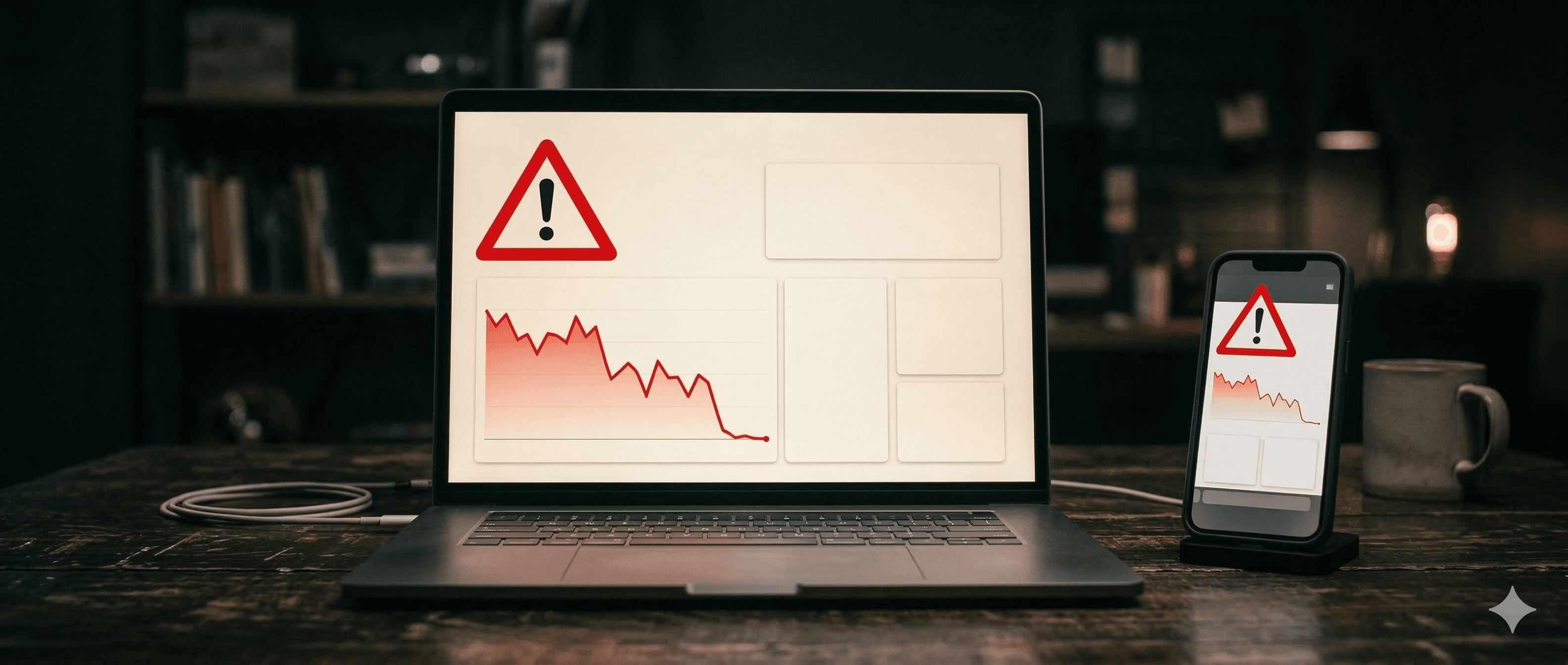
Your Website Might Be the Problem
You've invested in your business. You've built something you're proud of. But when you look at your website, something feels off. Enquiries are slow. People visit but don't get in touch. You suspect your site isn't pulling its weight — but you can't quite put your finger on what's wrong.
You're not alone. Most small business owners know their website isn't great. They just don't know exactly what to fix first. And that uncertainty keeps them stuck — paying for a site that quietly turns potential customers away, month after month.
Here's a stat that might surprise you: 88% of online consumers are less likely to return to a website after a bad experience (Amazon Web Services). That means your website doesn't just need to exist — it needs to work. Below are the five most common signs that your small business website is not working the way it should, along with exactly how to test and fix each one.
Sign 1: It Takes Too Long to Load
Speed is the foundation everything else sits on. If your website takes more than three seconds to load, most visitors will leave before they see a single word you've written. They won't wait. They'll hit the back button and visit your competitor instead.
And it's not just about user patience. Google actively ranks slow websites lower in search results. If your site is sluggish, you're invisible to the people searching for exactly what you offer. According to research by Akamai, a 1-second delay in page load time reduces conversions by 7%. For a business generating €10,000 a month through its website, that's €700 lost — every single month — because of one second.
The most common culprits are unoptimised images (large photo files that haven't been compressed), cheap shared hosting that slows down during peak traffic, and too many plugins or scripts running in the background. The good news is that this is one of the easiest problems to diagnose.
How to test it: Go to Google's free PageSpeed Insights tool, enter your website address, and look at your mobile score. If you're scoring below 80 on mobile, your site is actively costing you customers. Above 80 is good. Above 90 is excellent.
Sign 2: It Doesn't Work Properly on Mobile
Pull out your phone right now and open your own website. Really look at it. Is the text easy to read without pinching and zooming? Can you tap the buttons without accidentally hitting the wrong one? Does the layout make sense, or do you have to scroll sideways to see everything?
58% of all web traffic now comes from mobile devices (Statista, 2024). That means more than half of your potential customers are seeing the phone version of your site first — and for many of them, it's the only version they'll ever see. If that experience is broken, you've lost them.
A broken mobile experience looks like this: text so small you need to squint, images that overflow the screen, navigation menus that don't collapse properly, and buttons crammed so close together that tapping one triggers another. These aren't minor annoyances — they're deal-breakers.
There's also an SEO dimension. Google now uses mobile-first indexing, meaning it primarily looks at the mobile version of your site when deciding where to rank you. A desktop site that looks stunning but breaks on mobile will rank poorly across the board.
How to test it: Use Google's free Mobile-Friendly Test tool. It will tell you exactly what's failing and why.
Sign 3: Visitors Don't Know What to Do Next
Imagine walking into a shop where nobody greets you, there are no signs, and you can't find the till. That's what a website without clear calls to action feels like. Your visitors land on the page, read a bit, and then... nothing. There's no obvious next step. So they leave.
This is one of the most common — and most costly — mistakes small business websites make. Every single page on your site should have one clear primary action you want the visitor to take. Not five actions. Not zero. One.
Bad calls to action look like this:
- A "Contact" link buried in the footer that nobody scrolls down to find
- Vague button text like "Learn More" or "Click Here" that doesn't tell people what happens next
- Multiple competing buttons that overwhelm the visitor with choices
- No button at all — just a wall of text with no direction
Good calls to action are specific and benefit-driven: "Get a Free Quote in 24 Hours," "Book Your Free Consultation," or "See Our Pricing — No Hidden Fees." They tell the visitor exactly what they'll get and exactly what to expect.
The numbers back this up. According to HubSpot, companies with clear, targeted calls to action see 202% more conversions than those without. That's not a marginal improvement — it's a transformation.
Sign 4: It Looks Like It Was Built in 2015
You might think design is just about aesthetics. It's not. Design is about trust. When someone lands on your website for the first time, they make a snap judgement — usually within a few seconds — about whether your business is legitimate, professional, and worth their time.
A landmark Stanford study found that 75% of consumers judge a company's credibility based on its website design. Three out of four people decide whether to trust you based on how your site looks. Not what it says. How it looks.
If your site has any of these telltale signs, it's working against you:
- Generic stock photos of people shaking hands in a boardroom
- Tiny, hard-to-read fonts crammed into narrow columns
- A cluttered layout that tries to say everything at once
- Outdated design trends like heavy drop shadows, glossy buttons, or Flash animations
- No customer reviews, testimonials, or trust signals anywhere on the page
Modern websites that build trust share a few key traits: clean layouts with plenty of white space, real photography (even phone photos beat stock images), visible customer reviews, clear guarantees or return policies, and professional typography that's easy to read on any screen. Your website doesn't need to be flashy. It needs to feel current and credible.
Sign 5: You Can't Update It Yourself
Here's a scenario that's far too common: your business phone number changes, or you add a new service, or you need to update your opening hours for a bank holiday. So you email your developer. And wait. Maybe they get back to you in a few days. Maybe they charge you €50 to change a single line of text. Maybe they don't respond at all.
Being locked out of your own website is more than just frustrating — it's expensive. Stale content sends a clear signal to both visitors and search engines that your business isn't active. Google favours websites that are regularly updated with fresh, relevant content. A site that hasn't been touched in months will gradually slide down the rankings.
A proper content management system should let you do basic updates in five minutes or less — no coding knowledge required. You should be able to:
- Change text, phone numbers, and addresses instantly
- Add new photos or swap out old ones
- Publish a new blog post or announcement
- Update your pricing or service descriptions
- Add seasonal promotions or holiday notices
If you can't do any of these things without contacting a developer, your website setup is holding your business back. You should own your website and have full control over it — full stop. Any arrangement where you're dependent on someone else to make basic changes is a red flag.
What to Do Next
Now that you know what to look for, take ten minutes and run through the list. Test your speed on PageSpeed Insights. Check your mobile experience on your phone. Look at your site with fresh eyes and ask yourself: if I were a customer visiting for the first time, would I trust this business? Would I know what to do next?
If you spotted one or two issues, the good news is they can often be fixed without starting from scratch. Compress your images, add a clear call-to-action button, or update your design with modern fonts and real photos.
But if three or more of these signs sound familiar, a full rebuild is almost always faster and more cost-effective than trying to patch an outdated site. You'll spend less time fighting old problems and more time with a website that actually generates business.
At Smarter Hosts, we build clean, fast, mobile-friendly websites for small businesses — with a one-time fee, no monthly lock-ins, and full ownership from day one. If you'd like to see what a modern site could look like for your business, we're happy to chat.
Your Website Works 24/7 — Make Sure It's Working For You
Your website is your hardest-working employee. It doesn't take holidays. It doesn't call in sick. It's there for every single person who searches for your business, every hour of every day. The question is whether it's greeting those people with confidence and clarity — or quietly turning them away. Run through the five signs above, be honest about what you find, and take that first step toward a website that works as hard as you do.